Components
Here we cover some of the components used within the Fairfax & Favor website. These components have been designed to compliment the brand and style.
PRODUCT TAGS
These tags are used to alert the customer to the status of a product, so they are exclusively used on a product call to action (CTA), whether a main collection page, feature or related carousels or the homepage featured sections.
Tags are either singular or can be dual where there are multiple status' such as LOW STOCK and LIMITED EDITION. For mobile size only, we would only show the primary tag not dual tags due to restrictive screen size.
<div class="p-1 text-xs leading-none tracking-wider uppercase border border-black inline-block">
	Tag Status
</div>
<div class="inline-flex text-xs leading-none tracking-wider uppercase border border-black">
	<span class="p-1 bg-white inline-block">
		Dual Tags
	</span>
	<span class="p-1 bg-black text-white hidden sm:inline-block">
		Extra Info
	</span>
</div>
TABS
To jump between content we use tabs. The first tab shows content by default and is highlighted on screens larger than mobile with the signature brand gold under the tab, which follows the next selected tab.
For mobile we display tabs as a stacked accordian rather than inline, we cannot guarantee the user would swipe to see more so for usability and accessibility we change the format.
BREADCRUMBS
Breadcrumbs are an important part of navigation and for SEO. We use a small size typeface, one size down from the default, so it's still very legible whilst accommodating this can be long text, taking up space. For back links we use the brand gold without underline, until hovered.
Home / Collection Name / Product Title - Colour
PRODUCT CARDS
The collection pages set the style for other cards, with the very light background colour on images, the distinctive upward pointing chevron breaking out from the 1 pixel bottom border, and two tone Title and Subtitle.
As the most important cards, we use a grid of 3 per row which reduces to 2 for mobile. All other product cards within the site use a grid of 4 per row.
Product cards are also used in relative content sections, such as 'you may also like', 'recently viewed' or 'featured products'. These will commonly be placed in a sliding carousel that will adapt from a grid of 4 cards in a row to 3 for tablet, down to 2 for mobile.
In recommended / related products (such as care products or accessories) we may also include a direct 'ADD TO BAG' button, as illustrated in the first card below, most will simply link straight through to the product detail page (PDP).
FEATURE CARDS
Used in places such as collection cards or 'Spotted In' cards, these cards are designed to be distinct from product cards so visitors instantly recognise the difference.
The cards display in a grid row. They will adapt to the height of the deepest card for horizontal harmony. The last card in the example below shows there can be a big difference in height, so it is important that those curating the content attempt to maintain a similar length of text in each card, to keep balance.
To give more impact to the title, we give the subtitle at 0.75 opacity opacity-75. It's subtle but the details count.

British Equestrian
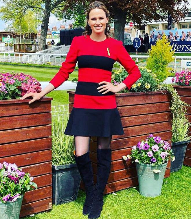
ITV Racing Presenter
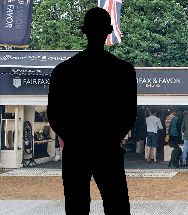
Former Equestrian Commentator & National Treasure
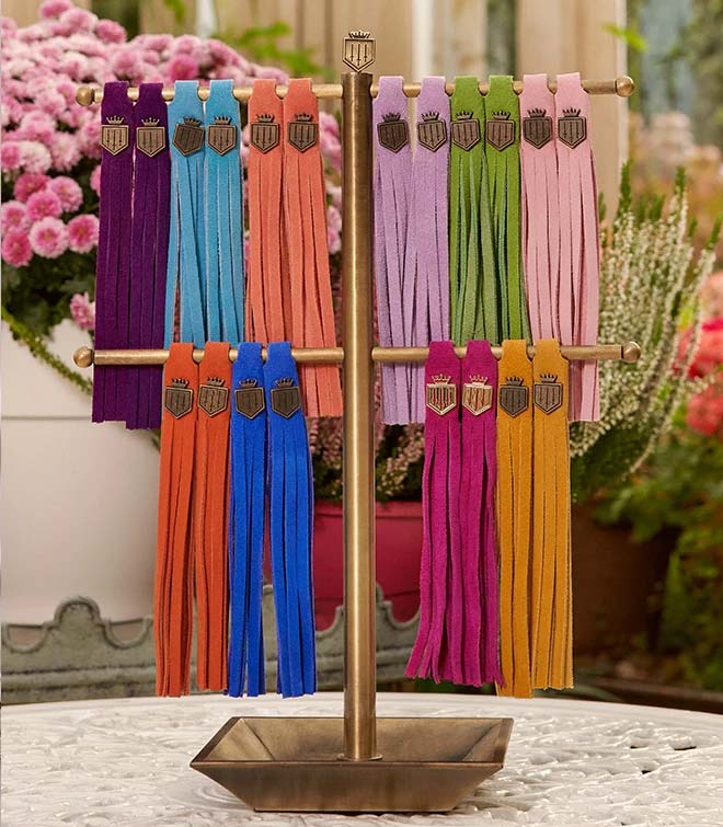
CONTENT CARDS
For content cards, used commonly in news, blogs or descriptive contexts, we adapt back to a grid row of 3 to allow more space for longer content, adapting to 2 for tablet and full width for mobile - we are careful to avoid a claustophobic or cluttered feeling, space and room are important.
Featured or guest content uses an alternate template with the brand navy background and all white text, with the category off-white with opacity of 0.75.

TITLE OF ARTICLE
Lorem ipsum, dolor sit amet consectetur adipisicing elit. Alias corrupti voluptate quibusdam magnam ut nam autem eaque est provident laborum enim aliquam asperiores consequuntur repellat, perspiciatis vitae rem quod inventore.

TITLE OF ARTICLE
Lorem ipsum dolor sit, amet consectetur adipisicing elit. Fugiat aut repellat, animi consequatur temporibus ipsum quo rem aliquid similique obcaecati molestias vitae modi saepe inventore quibusdam magnam facere enim, sapiente!

TITLE OF ARTICLE
Lorem, ipsum dolor sit amet consectetur, adipisicing elit. Fugit blanditiis aut, unde aperiam. In sapiente commodi non, est porro esse nobis.
FEATURES HOTSPOTS
This is an experimental feature yet to be implemented.

FEATURES
Click a hotspot to see a feature.


